Figma Lo-FI prototype client project
Introduction
Following our first presentation for our client project we started making iterations of our prototype designs starting with low-fidelty and than later on also high fidelity prototypes using Figma. From the feedback we’ve got during the presentation, we got the greenlight on the overall ideas and concepts that we had presented to our stakeholders from Stuurmen.Following our first presentation for our client project we started making iterations of our prototype designs starting with low-fidelty and than later on also high fidelity prototypes using Figma. From the feedback we’ve got during the presentation, we got the greenlight on the overall ideas and concepts that we had presented to our stakeholders from Stuurmen.
These were the main points they wanted to see in our prototype:
- Be able to make child profiles
- Settings page
- Internalization of the app, we have to continue with that, by adding more languages
- Creating choices in the story to create follow up storylines, but we have to make sure it doesn’t contradict with the attention span idea.
- Having multiple reading modes, like adult and child
Process
I have made my own version of the lo-fi wireframe, while my studio members focused on their own versions as well, during this time I ended up working with only one member of my group, so we couldn’t go all out on our ideas regarding our final product, since we had a lot of plans for our client’s product, so we decided to only focus on the client’s requirements according to their Moscow method that they’ve given to us during the briefing.

Iterations
Prototype Version 1
This is the first attempt of my story generation application it only consists of the main screens login, homepage and generator app, as feedback I got here that it’s still a lot of text for the generation page, but it’s a good start, since it’s a children app it was advised to keep the interface more clean, another thing that was told is I had to find a way to make it as an app and not like a traditional website interface.
Prototype Version 2
After the feedback I received last time I made sure to include it into my second version of the prototype and I decided to make a survey for this version along with my studio member’s version. To get some input from peers, friends, teachers and colleagues.
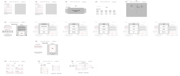
In the second version I expanded on the previous one with improved changes, I also added a settings page for the adult users to add a child where they can also fill in additional information, such as their reading level, by doing this it would automatically switch to the correct reading level during story generation for the child.
This version also has the option to change the language option for the app, which was something the clients suggested us. The interface looks more cleaner and if the user wants to select an option for generating a story they’ll now get a pop-up screen for the theme, characters etc. which will make it more appealing to use and user friendlier.
Lastly, I got rid of the additional side menu-nav bar, instead I kept the top-menu navbar and extended it with additional features for easier navigation, the user can also directly logout or login, or proceed to browse through the app while being a guest.
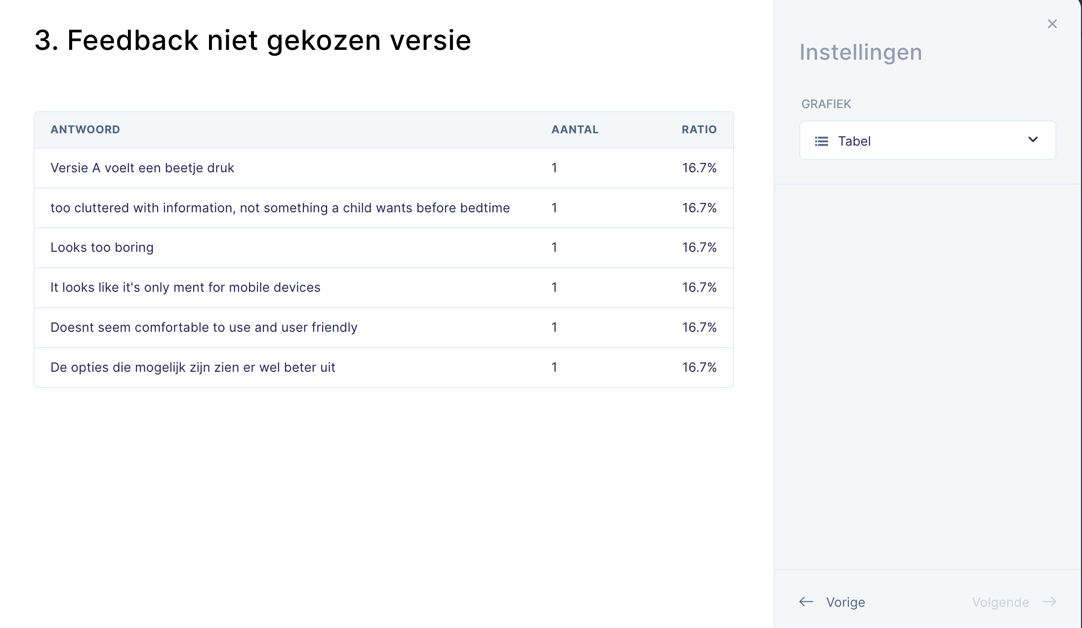
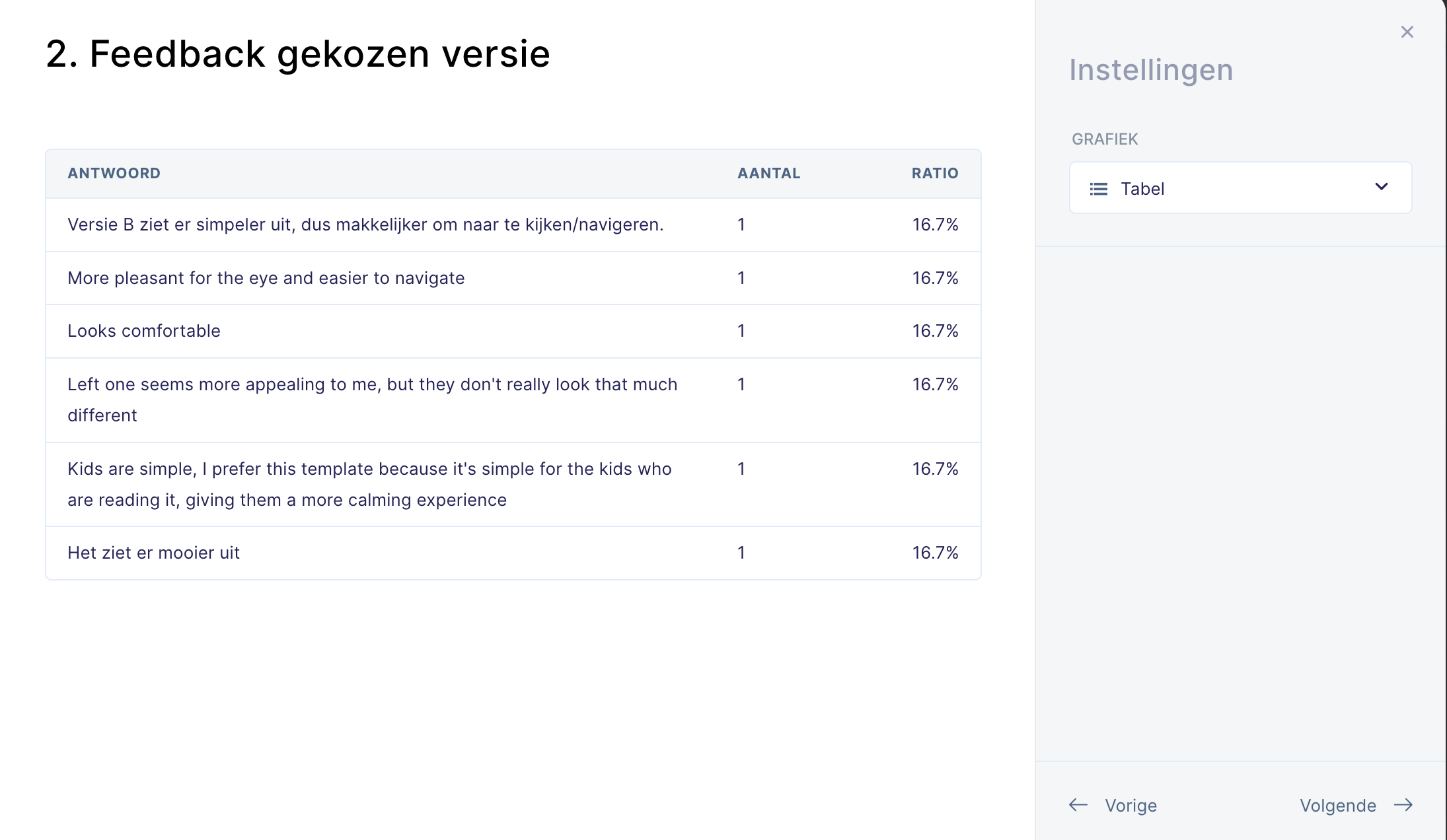
Feedback from survey
Overall, participants from the survey preferred the wireframe prototype from my other member, because they liked how comfortable it looked and a simple design, especially for a app that’s ment for children.
Here is some of the notable feedback why they didn’t preferred mine:
• This version looks a bit busy or overwhelming with information
• Seemed to be lacking on the user-friendly side
• It looks like it’s intended for mobile devices.
I agree with the feedback, but the last point feels a bit ironic. The app actually needs to resemble a mobile app more than a web app. It has to be easier to use, with touch-friendly controls and a full-screen design to keep users focused. This approach works better on tablets and phones, which aligns with our previous survey showing that most parents prefer using these devices over computers when reading to their children.
Reflection
I learned that making iterations like this is important because it helps me understand what users really want. Even though some participants from the survey didn’t prefer the features in my wireframe compared to others, my wireframe still included some key and mandatory elements that the others didn’t have, which will have usage later on. The next step is to combine our two wireframes into one, keeping only the screens that were well-received by the participants. I’ll keep improving these iterations and start getting ready for the second concept presentation for our clients.
The figma prototypes and related sources can be found below
Appendices
- FIGMA LOW-FI 1
- FIGMA LOW-FI 2
- SURVEY LINK
- SURVEY RESULT 1
- SURVEY RESULT 2
- SURVEY RESULT 3