Figma Hi-fi prototype client project
Introduction
After presenting our 2nd concept presentation about our branding and the final lo-fi fidelity version of our AI story generator prototype to the clients, I received feedback from them on what they wanted to have in the final version. Our presentation was well received, especially since we continued this project with only two of us. They wanted to us refine what we already have and add or change some as the following :
Feedback clients
• an way to quick start story generation, because users who want to read aloud stories don’t always want to spent a lot of time to configure their stories, this also applies to character creation.
• No profile picture needed for the child, a random image would be enough.
• Safety code – instead of a code, we could do something else, we were told to get inspired by the Youtube kids app.
• Educational/reading level needs to be more clear
• An way to read pre-made stories that are already existing on the app
• Signing in using 3rd party authentication and an make users able to use the app as a guest with limited restrictions
• Story creation screen consist of a lot of text, which could be reduced
• Reducing the number of navigation within the app, get inspiration from story tell
• Be critical and prioritize only the mandatory features for the app what’s achievable.
Process
This is the final lo-fi version that was showed to the clients, which is a combined wireframe prototype of mine and my studio partner, but I completely redesigned it with all the key functionalities and features. You can see the old version on this wireframe.
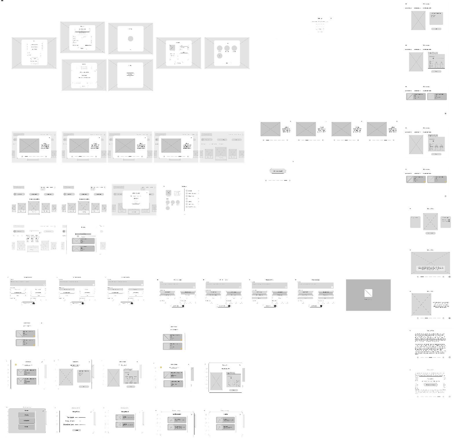
It has all the mandatory requirements which will be implemented in the final version of the application, the goal now is to make the hi-fi version of this wireframe with all the changes that was requested by the clients as shown above. The following changes will be added or refined to the newest iteration of our wireframe: Homepage, UI/UX, story generation, reading level, story randomizer button, change layout (reduce text), safetycode method, skip signup and lastly the single sign in option.
Final Hi-fidelty prototype iteration
This version includes all the colors and changes I added to my latest prototype in Figma. The colors are based on the branding my studio member and I did earlier, before I started working on this hi-fidelity prototype. These theme colors were approved by the clients beforehand, so we used them for this design.
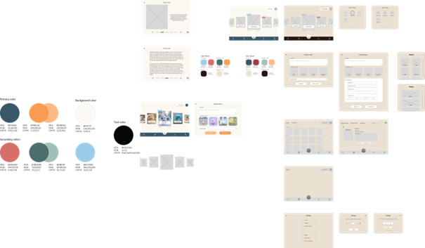
I made quite some changes based on what the stakeholders wanted. They asked for fewer navigation buttons on the homepage to make it look cleaner, so I moved the navigation to the bottom and placed the story generation button in the center, replacing it with a book icon. I also added icons for buttons like Home, Favorite Stories, and Settings to make the homepage more organized and easier to use.
For accessing the settings screen as an adult, users now solve a quick math quiz or a puzzle instead of using a safety code, which isn’t really needed for a children’s app.
Logging in has been simplified too. Users don’t have to log in anymore to access the app, I added a "continue as guest" button. However, creating child profiles still requires an account. For those who already have an account, they can quickly log in with 3rd party authentication without entering credentials manually.
Lastly, on the story generation page, I added a bar indicator with reading difficulty tags so users can easily choose the right level for their child(ren). There’s also a “random story” button now, so users can instantly generate a story without customizing or configuring everything on the screen.
Feedback
I got feedback from a teacher on this hi-fidelity prototype, and it was really positive. I was encouraged to keep going with it. For example, the teacher said adding our branding logo of the AI story generator app to the homepage was a great idea because it makes the button stand out and leaves a good impression. They also suggested it could be even better if the button had some animation when pressed.
For the story generation page, the teacher recommended simplifying it more, like using a wheel-style navigation with icons instead of so many buttons. This could make it stand out even more and give users a better experience.
They also said that having multiple iterations, like the ones I’ve done, was a smart move because it gives clients more options to choose from and ideas for the future. This could also help if another team takes over the project later.
Lastly, the teacher gave advice about the backend, saying I need to be careful with AI usage to make sure users' sensitive data isn’t exposed. I’ll need to add enough restrictions and validations to avoid data breaches I just need to figure out how to do it.
Reflection
What did I learn?
I learned how important it is to listen to feedback from stakeholders and users to improve my design and make sure it meets their needs, I also realized how useful it is to create multiple versions in Figma so there are more options for future changes or improvements.
What will I do next?
After getting the required input from my peers and teachers I will start making the first coded web version using the frameworks Nextjs and React, I have already deployed an git repository for this project.
For more info and sources, you can find it below in the appendices.